14 Wordmark Gaming Logos That Dominate the Industry
You know the feeling. It’s the start of the weekend. No work, no responsibilities. Just you, your squad, a stack of empty pizza boxes, and your favorite game.
The world outside doesn’t exist. Your screen glows like a portal to another realm, and as the subsequent match loads or the story continues, there it is: that iconic wordmark logo.
Bold, stylized, and instantly recognizable, it’s a symbol of countless hours, epic wins, rage quits, and unforgettable memories.
Whether crafted by a pro or a logo maker, the design had power.
Let’s get started!
Iconic Console Brand Wordmark Logos
Before the games, before the graphics, before we even picked up a controller: there was the console logo. That glowing, confident wordmark splashed across the box or burned into the startup screen told us everything we needed to know: this was a gateway to another world.
Here are four iconic console brand wordmark logos that shape the look of their eras and the hearts of gamers who lived them.
1. PlayStation
Simple yet powerful, the PlayStation wordmark has always carried a cool, futuristic vibe. With its clean, rounded letters and subtle italics, the original design felt like it came straight from a sci-fi world where fun and imagination ruled.
The second you saw it, you could already hear the iconic startup chime, followed by hours of gaming magic. PlayStation’s wordmark symbolizes growing up with games that made you think, feel, and sometimes rage-quit in style.
2. Nintendo
Bright, friendly, and instantly recognizable, the Nintendo wordmark is a piece of pure gaming nostalgia. Framed in that iconic red and white, the rounded letters feel like an invitation to play. It’s welcoming, like an old friend handing you a controller and asking, “Wanna play Mario?” You don’t say no to Nintendo.
This logo has endured every evolution, from NES to Nintendo Switch 2, constantly adapting but never losing that childlike spark.
3. Xbox

With its bold, angular style and no-nonsense attitude, the Xbox wordmark feels ready for battle. From the first green-hued launch, it stood out as the cool rebel of gaming: edgy, sleek, and powerful. It looked like it belonged on the side of a spaceship or a futuristic weapon. Either way, you knew it meant serious gaming.
4. SEGA
Loud. Proud. And chaotic. The SEGA wordmark announces itself. Those chunky, electric-blue letters with sharp cuts and slight tilt practically shout the brand’s name before the classic “SEGA!” voice even kicks in. It feels fast, fun, and energetic, just like the games it represents.
Iconic Franchise Game Wordmark Logos
Here are 10 unforgettable franchise wordmark logos that became just as legendary as the games themselves:
Pokémon

The Pokémon logo is pure adventure in a bold, bubbly font. The bright yellow letters outlined in blue practically jump off the screen, full of excitement and energy. It is playful, inviting, and instantly recognizable. Even before you caught your first Pikachu, that wordmark promised you a world full of imagination and discovery.
What makes it iconic is how it speaks to all ages. Kids see it and feel wonder; adults see it and feel nostalgia. It is a rare and unique logo that feels alive, like it’s part of the journey and not just the packaging.
Minecraft

Minecraft’s logo looks carved out of the blocks you use in the game. The chunky, stone-like font captures the entire aesthetic of its world. It is pixelated, rugged, and full of possibility. It tells you right away that this isn’t just a game. It is a sandbox for your imagination.
What’s brilliant is how simple and bold it is. There are no frills, just structure and strength. It stands tall, like something you would build yourself in survival mode. One glance and you’re already planning your next pixel-perfect creation.
Grand Theft Auto

The Grand Theft Auto wordmark is gritty, rebellious, and instantly recognizable. That stacked, black-and-white typeface has been part of the franchise since the early days. It has become as iconic as the wild stories it tells. It looks like it belongs on a street sign or a rap album. It is bold, urban, and unapologetic.
Every new GTA game keeps the same font, and that consistency gives the logo its power. No matter the city or period you’re thrown into, when you see that wordmark, you know you’re about to enter a world where rules are made to be broken.
The Witcher
The Witcher’s logo feels like something out of an ancient book. The sharp, jagged serif font gives it a gritty, old-world elegance that perfectly fits its dark fantasy setting. It looks serious, mysterious, and full of weight, just like the stories it tells.
This wordmark feels like a warrior’s crest or a legend’s title. When you see it, you know you’re in for rich lore, moral choices, and monsters that never go down easy.
Red Dead Redemption
The Red Dead Redemption logo is rough, bold, and full of Western attitude. The blocky, distressed typeface looks like it was printed on old wanted posters or stamped into wood. It feels raw and rugged, matching the dusty, lawless world the game takes place in.
Its strength lies in its simplicity. It does not try to look modern or flashy. It looks worn and weathered, like it belongs to another time. That makes it feel so real, and that’s why it sticks with you long after the sun sets on the frontier.
Hitman

Hitman’s wordmark is clean, sharp, and quiet. The all-caps serif font feels professional and cold, with a slightly elegant touch. It does not shout. It whispers. That quiet confidence makes it feel more dangerous than any flashy design could.
It gives off the vibe of a high-end assassin’s calling card. You see it and instantly think of stealth, strategy, and silence. It is a masterclass in how minimalism can still create severe tension.
God of War

The God of War logo feels ancient and powerful. The bold, chiseled letters look like they were carved in stone. The signature omega symbol adds a mythic touch. It radiates strength and fury, hinting at the rage and battle that define the series.
Every version of the logo has evolved with the game’s tone. From the fiery early years to the more emotional Norse saga, the wordmark adapts while still carrying that same legendary weight. When you see it, you know something godly is coming.
The Sims
The Sims logo is bright, quirky, and full of life. The friendly font and signature green color give it a playful, almost toy-like feel. Of course, the famous green plum bob is often nearby, making it instantly recognizable to any fan.
It perfectly captures the spirit of the game. It is fun, a little chaotic, and all about creating something uniquely yours. When you see the wordmark, you are not just thinking about virtual people. You are thinking about stories only you could have made.
FIFA

The FIFA wordmark is clean and official, just like the sport it represents. The strong, no-nonsense font often paired with a globe or EA logo gives it a global presence. It looks like it belongs in a stadium or on a jersey.
It does not need flash. Its legacy speaks louder. Every year, the same wordmark signals a new season’s start and the return of intense rivalries. It is a banner for fans who live and breathe football (or soccer if you’re in the US).
NBA 2K
The NBA wordmark in the 2K series combines energy and professionalism. It blends the league’s official style with the bold graphics of a fast-paced sports game. The numbers are significant, the letters are strong, and the whole thing screams motion and momentum.
This logo does not just stand for basketball. It stands for your basketball journey. Seeing that wordmark means it’s game time, whether you’re on the blacktop or in the big leagues. You are about to ball out.
Tips When Creating Wordmark Logos
Here are four key tips to keep in mind when creating a strong and memorable wordmark logo:
- Choose the right font personality: The font should match the brand’s vibe. A horror game might call for sharp, jagged letters, while a cozy farming sim needs soft, rounded shapes. Always let the font reflect the mood and experience you’re offering.
- Keep it simple but unique: Simplicity helps with recognition, but avoid being generic. A slight tweak to a letterform or a creative use of spacing can turn a basic font into something memorable and ownable.
- Think about versatility: Your logo should look good on everything from tiny app icons to full-sized posters. Test it in black and white, scale it down, and see if it still holds shape and impact.
- Let it reflect the brand’s world: A great wordmark feels like it belongs inside the game or brand universe. Let the style speak to the story, genre, or theme so that people get a sense of what it’s all about even without context.
Here are a few examples to get you started:
Arrow Scribble Gaming Logo by BrandCrowd
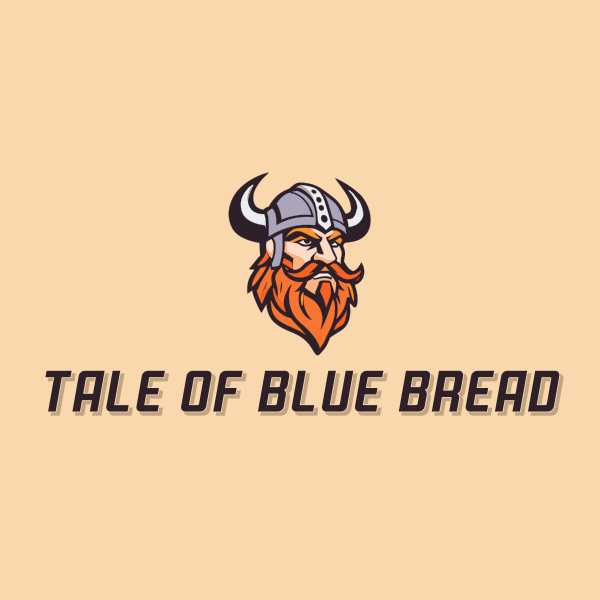
Viking Warrior Gaming Logo by BrandCrowd
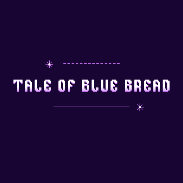
Pixel Game Arcade Logo by BrandCrowd
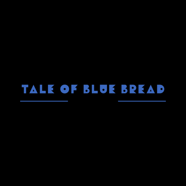
Retro Gaming Technology Logo by BrandCrowd
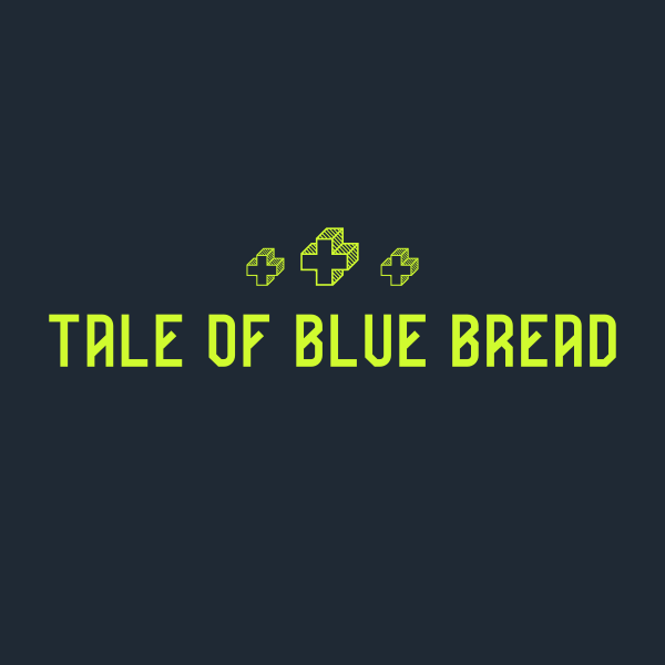
Neon Gaming Streamer Logo by BrandCrowd
Tarantula Gaming Gem Logo by Design.com
Game Dev Media Agency Logo by Design.com
Gothic Floral Pattern Design Logo by Design.com
Evil Gamer Glow Logo by Design.com

Urban Gothic Studio Logo by Design.com
Design Your Wordmark Gaming Logo Today
A strong wordmark logo is an identity, personality, and power all rolled into a single visual. Whether creating a new game, launching a brand, or starting a personal project, your logo sets the tone at first glance. It should be clear and memorable and tell people exactly what you’re about without saying a word.
If you’re ready to bring your vision to life, BrandCrowd can help. With thousands of customizable templates and easy-to-use tools, BrandCrowd makes it simple to design a professional wordmark logo that fits your style.
Read More on Gaming Logos Here:
- 10 Most Iconic Gaming Logos of All Time
- 30 Gaming Logos for Valorant Clans
- How To Create a Gaming Logo
Shayne Jain is a content writer with 7 years of experience specializing in creating engaging and impactful content. Her passion for writing began at age 8, when she started crafting short stories and songs. When she’s not writing, you can find her kicking balls on the football field or immersed in a good video game.
Original Artwork by Selwyn Legaspi