40 “S” Logos for Stunning Visual Marketing
Updated June 17, 2025
A thoughtfully designed letter S logo is a powerful brand statement that rises above the competition.
With its natural curves and sense of movement, the letter S creates sophistication and momentum, establishing your brand as a memorable visual presence. Paired with a razor-sharp business name (generated effortlessly with our AI-powered tool) and you’ve just created a cohesive brand universe.
Beyond its aesthetic grace, S logos anchor brands to concepts like speed, success, and sustainability.
Ready to make your mark? Dive into our curated gallery and discover how the right “S” can become the signature of your brand’s legacy.
S Letter Logo Ideas
We’ve collected letter S logos to help you see how they fit perfectly with your brand.
Check them out below:
Famous logos that start with “S”
What better way to see the beauty of the letter S logo than the famous logos? Check out the famous logos that start with the letter S:
Scania
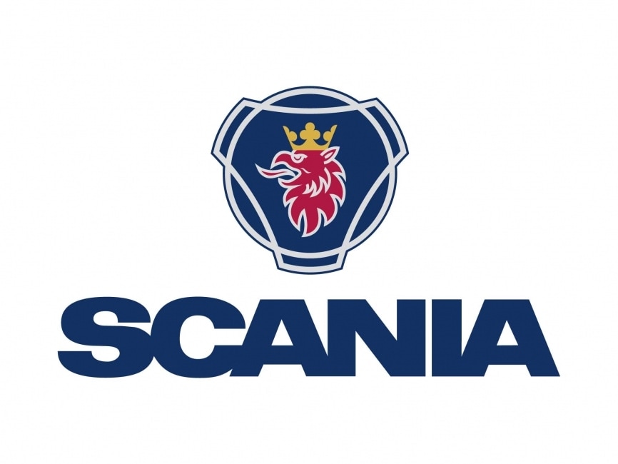
Scania’s logo features a fierce griffin head encased in overlapping geometric shapes. This mythological creature symbolizes strength and reliability, aligning with the brand’s identity as a leader in heavy-duty vehicles. The logo’s bold typography and emblem design convey power and precision.
Shimano
The Shimano logo uses a simple, uppercase sans-serif font in a cool blue hue. This clean, no-frills design reflects the brand’s engineering focus and technical expertise in cycling and fishing equipment. The logo emphasizes clarity and trustworthiness.
Singapore Airlines

Singapore Airlines features a stylized bird icon inspired by a silver kris, a traditional dagger. The golden-yellow and navy color palette evokes luxury and heritage. Combined with refined typography, the logo speaks to the airline’s reputation for premium service and Southeast Asian elegance.
Škoda

Škoda’s logo showcases a distinctive winged arrow encased in a circular frame. The green-and-black color scheme promotes sustainability and innovation. This dynamic emblem has become a symbol of forward movement and technological precision in automotive manufacturing.
Spotify
Spotify’s logo includes a vibrant green circle with three curved lines representing sound waves. The clean, lowercase wordmark beside the icon reinforces a friendly, tech-savvy personality. It’s optimized for digital platforms, reflecting the brand’s focus on streaming and accessibility.
Steam

Steam’s logo depicts a mechanical linkage system resembling a crank arm, nodding to its gaming and software roots. The dark, monochromatic, and gradient theme fits its tech-focused and gamer-centric audience. Its industrial aesthetic suggests performance and power.
Subway

The Subway logo incorporates arrows on the “S” and “Y” to symbolize movement and freshness. The bright green and yellow color scheme promotes health and vitality, aligning with its fast-food identity. Meanwhile, the bold typeface enhances readability and brand recall.
Super Mario World

Super Mario World’s logo uses a playful, multi-colored wordmark with exaggerated serifs and bubbly letters. This design captures the whimsical, adventurous spirit of the iconic Nintendo game. Each letter bursts with color and energy, appealing to a wide age range of gamers.
Swift

The Swift logo is clean and minimal, featuring a swallow silhouette against an orange background. Often seen in tech and financial industries, the design emphasizes speed, connection, and modernity. The sleek typography supports its association with innovation and agility.
Sleek Letter S Logos
Each refined letter S logo showcases meticulous attention to detail, combining clean geometry with minimalist elegance. The designs strike the perfect balance between contemporary sophistication and timeless appeal.
From cutting-edge technology companies to high-end fashion brands and established professional services, these logos deliver impact through strategic simplicity.
Every curve and line works together to create a distinctive and effortlessly versatile mark across all applications.
Check out our S letter logos below:
Media Letter S Sleek by Design
Coffee Bean Letter S by Design
Generic Tech Letter S by Design
S + Star Logo Concept – Silver Chrome by Lucas Fields
S LOGO, SS LOGO, LOGO DESIGN, LUXURY SS LOGO by Md Amir Hamja

Modern, Orange Real Estate: Self Storage Logo Design by emaviolar7
Simple Work Logo Design by Pradeep gangireddy
Elegant, Sail Logo Design by Rithadith
Jewelry Logo Design by dennisdesigns
Colorful, Letter S Entertainment Industry Logo Design by Sergio Coelho
Company It Company Logo Design by Dzains
Masculine, Company Fashion Logo Design by anna.lauren
Animal Letter S Logos
Combining the letter S with various animal characteristics, these logos add a unique touch to your brand.
If you want to evoke strength, agility, or grace, our collection has something for everyone. It is perfect for wildlife groups, sports teams, or anyone who loves natural charm.
Browse through our animal logos in the letter S form below:
Serpent Films logo design – S and Snake, film, movies, video. by Aditya Chhatrala

S + Swan Logo Mark by Design Burg for Brand Crown
S – Shark Sketch by Yoga Perdana
Upmarket, Horse Technology, Racing and Finance Logo Design by JWTL
Letter S Logo Design by JTdsign
Upmarket, Yellow Technology, by ds | designstructure
Bold S logos
When subtlety isn’t enough, bold S logos command the spotlight with unwavering confidence. These designs amplify the natural strength of the letter S through striking typography, dynamic proportions, and fearless visual presence.
Perfect for brands that refuse to blend into the background, these logos transform the letter S into a declaration of power and ambition. Whether you are a disruptive startup or an industry leader making your mark, each design balances audacious impact with professional credibility, ensuring your brand captures attention while maintaining respect and trust across every touchpoint.
Find the ideal bold S logo here:
Masculine Bold Business by Design
Bold Shadow Business by Design
Neon Bold Studio Boutique by Design
Bold Futuristic Tech by Design
Generic Industrial Company by Design
Modern Industrial Generic by Design
Modern Generic Business by Design
Bold Comic Superhero by Design
Bold Circle Enterprise by Design
Why Use Letter-S Logos
Among all the letters, here’s why you should use the letter S logos:
1. Versatility in design
The letter S offers endless possibilities for creative design. Its curvaceous form can be easily stylized to fit any brand aesthetic, whether modern and sleek or classic and sophisticated.
2. Visual appeal
S logos are inherently symmetrical and balanced, making them visually pleasing and memorable. The smooth curves of the letter S can evoke feelings of trust and reliability, making your brand more appealing to potential customers.
A well-designed S logo can capture attention and leave a lasting impression.
3. Symbol of movement and fluidity
The shape of the letter S naturally suggests motion and fluidity, symbolizing innovation, progress, and adaptability. These are valuable traits for any brand, and an S logo can effectively convey these qualities, enhancing your brand’s dynamic and forward-thinking image.
4. Strong brand recognition
A distinctive S logo can enhance brand recognition across various platforms and marketing materials. Its unique and memorable shape ensures that your brand stands out in a crowded marketplace, making it easier for customers to remember and identify your business.
Design Your Letter S Logo Today
Whether you’re aiming for sleek sophistication or natural charm, our platform offers a wide range of options to suit your brand’s needs.
Check out our handwritten, script, cursive, or monogram logo maker now to find the style option you want.
With BrandCrowd, you can create logos, find the perfect business name, and access advertising templates to elevate your brand’s presence.
Start building your brand identity effortlessly and efficiently with BrandCrowd today!