P is for Prestige: Famous Letter P Logos That Stand Out
Letter P logos.
Oh, they’re everywhere. The letter ‘P’ isn’t just a letter—it’s a branding powerhouse. There’s something about that singular, poised curve followed by a sturdy vertical line that makes it pop.
It’s got personality. It’s got presence. It’s got that undeniable punch that brands crave when they want to be remembered.
How many massive brands slap a bold “P” onto their logos and call it a day? Pepsi? Porsche? PayPal? The P logo dominates industries like an alpha leader, silently flexing in the background while consumers fall into its psychological grip.
But why? What makes letter logos, especially “P,” so powerful?
Let’s break it down!
The Psychology of Letter P in Branding
Ever notice how “P” feels dynamic? It’s not a passive letter—it has movement, purpose, push. Psychologically, the letter ‘P’ carries a sense of professionalism, prestige, and power.
- Sharp and clean: The letter is easy to read, even in the wildest fonts.
- Energetic and playful: That curve in the ‘P’ adds a touch of creativity, balancing logic and fun.
- Power and performance: It’s used in tech, luxury, and even sports brands to convey confidence.
- Trust and stability: Many financial and security-based companies use ‘P’ to symbolize reliability.
It’s a mix of sharpness and flow, direct but not rigid. No wonder brands love to slap a ‘P’ on their logos.
Related: Check out our blog: 45 Letter Logos for a Bolder Brand Identity
Famous P Logos
Some logos are forgettable. Others? They burn into your brain like a neon sign you can’t look away from. And guess what? A lot of those unforgettable logos start with the letter “P.”
Let’s check out ten iconic “P” logos and why they’re absolute branding gold.
1. Pepsi
The Pepsi logo is undeniable.
That bold, round letter “P” sits proudly at the beginning of one of the world’s most recognized soda brands. Over the decades, the design has evolved—from vintage script to the modern, spherical red-white-and-blue emblem—but “P” has always been the anchor.
It’s playful, punchy, and instantly recognizable in any language.
✔ Why it works: The simplicity of the ‘P’ balances well with the brand’s signature globe, making it visually striking and timeless.
2. Paypal

PayPal didn’t just put “P” in its name—it doubled down with two! The logo’s overlapping blue Ps symbolize connection and security, reinforcing its role as a trusted financial service.
The design is sleek, modern, and slightly italicized, conveying speed and innovation.
✔ Why it works: Blue exudes trust, and the subtle forward-leaning motion suggests fast, secure transactions.
3. Porsche
If there’s one ‘P’ that screams luxury, it’s Porsche.
Nestled inside a regal crest, this ‘P’ stands for speed, craftsmanship, and status. The German automaker has never needed flashy gimmicks—just a clean, confident typeface paired with a logo that symbolizes heritage and engineering excellence.
✔ Why it works: The ‘P’ in this car logo represents power and performance, aligning perfectly with the brand’s elite reputation.
4. Pinterest
Pinterest turned the letter “P” into an icon of creativity. Their logo isn’t just a letter—it’s a pushpin!
The looping logo P mimics the act of pinning an idea to a board, visually reinforcing the entire purpose of the platform. It’s smart, stylish, and works across digital and print with zero confusion.
✔ Why it works: The clever pin shape is both functional and aesthetic, making the logo instantly memorable.
5. Patagonia
Outdoor gear meets iconic branding.
Patagonia’s P is surrounded by a bold yet inviting wordmark. Often paired with mountain silhouettes, the logo perfectly captures the brand’s adventurous spirit. It’s no-nonsense, just like the people who wear it.
✔ Why it works: The P in Patagonia reflects endurance, reliability, and a love for nature—core values of the brand’s identity.
6. PlayStation
Sony’s PlayStation logo is a work of art. The stylized P forms a three-dimensional shape when combined with the S, creating a futuristic logo even decades after its debut. The sleek, abstract approach stands out in the gaming industry, where visuals are everything.
✔ Why it works: The dynamic, dimensional design represents motion and innovation, just like PlayStation’s gaming experiences.
7. Panasonic
Panasonic’s logo is all about professionalism. The clean, corporate blue P stands strong, symbolizing innovation and high-tech reliability. It’s not flashy, but it doesn’t need to be—Panasonic has built a reputation that speaks for itself.
✔ Why it works: The logo’s simplicity aligns with its global presence in electronics and consumer goods, emphasizing trust and expertise.
8. Pringles
Pringles took a different approach. Instead of a sleek or serious “P,” they went full fun mode. The “P” in this snack logo is part of their cheerful, mustachioed mascot—giving the brand a lively, friendly personality. The quirky, curved font adds to its lighthearted appeal.
✔ Why it works: The whimsical style makes it approachable, aligning with the brand’s playful identity and snackable nature.
9. Puma
Puma’s logo is more than just a letter—it’s an action.
The brand’s name is paired with a leaping cat, symbolizing speed, agility, and strength. The ‘P’ in Puma carries the same energy, standing tall in a bold, confident font that demands attention.
✔ Why it works: The aggressive yet sleek design matches the athletic, high-performance nature of the brand.
10. Paramount Pictures
That elegant ‘P’ sitting under a mountain of stars? It’s cinematic history. Paramount Pictures has been an entertainment titan for over a century, and its logo embodies grandeur, storytelling, and tradition. The script-like font feels classic yet sophisticated, making it the perfect fit for the silver screen.
✔ Why it works: The ‘P’ evokes a sense of legacy, glamour, and the magic of filmmaking.
P Logo Design Ideas
If you’re designing a ‘P’ logo, you have options. And you better believe that each style makes a statement. We’ve compiled three major categories (generic business P logos, fashion P logos, and pop art P logos):
Generic Business Letter P Logos
Sleek. Minimalist. To the point. Business logos featuring P usually favor modern, sans-serif fonts—clean lines, sharp edges, and a no-nonsense attitude. This works perfectly for:
- Law firms
- Consulting agencies
- Tech startups
Check out our collection of generic business letter P logos below:

Modern Business Letter P by BrandCrowd
Generic Agency Letter P by BrandCrowd
Professional Company Letter P by BrandCrowd
Generic Company Letter P by BrandCrowd
3D Generic Business Letter P by BrandCrowd
Fashion P Logos
Fashion brands love to stylize the letter P into something distinct—calligraphy, serif fonts, or even luxurious cursive that drips with elegance. A well-designed P in fashion branding can scream haute couture or edgy streetwear, depending on how it’s styled.
Get started with your fashion logos here:
Photography Design Studio Letter P by Design
Beauty Salon Lettermark by Design
Generic Modern Business Letter P by Design
Stylish Generic Wave Letter P by Design
Tech Startup Consulting Letter P by Design
Pop Art P Logos
Bold, exaggerated, and packed with color. If you want your P logo to feel like an explosion of creativity, dive into pop art influences. Thick strokes, neon hues, and playful design elements make a ‘P’ logo feel rebellious and alive.
Browse through our pop art P logos here:
Dynamic Abstract P Logo by Bohdan Harbaruk 🇺🇦
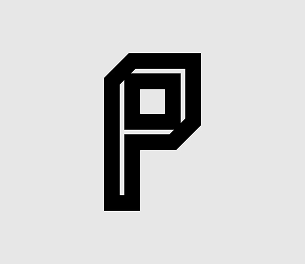
Letter P Logo Design by Callistra

Letter P Logo Mark – Modern Minimalist Design by Tornike Uchava
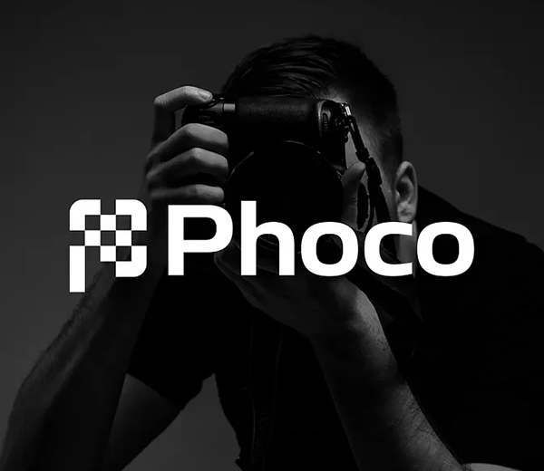
Design Your Letter P Logo Today
The letter ‘P’ isn’t just another character in the alphabet—it’s a statement. It’s iconic, adaptable, and loaded with psychological weight. Whether it’s a fast-food empire, a tech giant, or a high-fashion powerhouse, ‘P’ logos are unforgettable.
So, if you’re crafting a brand and considering a letter-based logo, don’t sleep on ‘P.’ It’s got the versatility, the punch, and the legacy to carry your business straight into the minds of consumers!