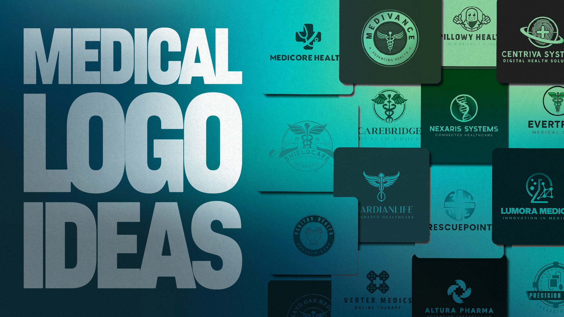
50 Medical Logos for Stronger Healthcare Brands
Healthcare workers, partners, and patients can judge a medical brand in seconds through its logo. Hence, medical logos don’t only have to look good — they should also evoke the feeling of authority, trustworthiness, and credibility.
It’s why most medical logos use clean designs, soothing color palettes, and well-known healthcare symbols. In this round, we’ll break down the key elements of these logos and provide logo design ideas that you can use to build or refresh your own medical brand.
Key Elements of Medical Logos
These design choices don’t belong exclusively to medical logos. However, healthcare brands do use some of them constantly as they’re effective in making them appear credible, safe, and easy to trust.
Recognizable medical symbols
Crosses, the Rod of Asclepius, and heartbeat lines are some of the most popular symbols used in medical logos.
The cross symbol has been around for centuries. One of the earliest examples is the Red Cross. In 1864, the founders wanted a neutral but easily recognizable symbol to mark medical personnel on the battlefield.
Red Cross
Meanwhile, the Rod of Asclepius is connected to the ancient Greek god of healing. Since 1948, the World Health Organization has used this symbol, along with olive tree branches and a globe, to represent global healthcare and international cooperation. Even after the logo was updated in 2006, the symbol remains, making it one of the most recognizable logos across cultures.
World Health Organization

Trust-building color palette
Blue is the go-to color of healthcare brands when designing their logos. This color evokes calmness, cleanliness, and dependability. One medical logo that uses blue is Blue Cross Blue Shield Association.
Blue Cross Blue Shield

Using blue may seem predictable given the organization’s name. Still, the blue icons made the brand instantly recognizable while also reinforcing a sense of reliability and professionalism, which are essential when providing health insurance and medical services.
Clean, legible typography
Medical logos aren’t only seen on billboards, signage, posters, flyers, websites, and social media platforms. People also see them on smaller materials, like ID badges, prescription pads, pharmaceutical packaging, business cards, and more. Hence, it’s important to prioritize readable fonts over aesthetic ones.
One good example is Sanofi, one of the world’s biggest pharmaceutical companies. Its logo uses bold, clean, rounded lowercase letters, projecting a more human-centered image. Meanwhile, the soft curves and subtle purple accent dots add a sense of innovation and optimism.
Sanofi
Simple, scalable icons
Just like with typography, the logo’s icons should also fit perfectly on smaller spaces without losing their intricate details. For example, pharmaceutical company Novo Nordisk uses a bull symbol with bold shapes and minimal details, enabling the logo to scale seamlessly on different materials — from small icons to large-format advertisements.
Novo Nordisk
Consistent identity
Medical logos need to be consistent to reinforce credibility and reputation. Making healthcare decisions isn’t simple. People need to know they’re dealing with healthcare brands they can trust.
Pfizer is one of those brands that demonstrated the power of consistent branding through its cohesive use of color, typography, and iconography. Even with its 2021 rebrand, people still recognize the logo’s wordmark all over the world.
Pfizer
Medical Design Ideas
Now that you know the key elements of designing a medical logo, it’s time to choose a style that will suit your brand. Medical logos can fall into different categories — each suited to a different kind of healthcare business.
- Minimalist Medical Logos
- Cross & Caduceus Symbol Logos
- Emblem & Badge Logos
- Mascot & Character Logos
- Modern Tech-Inspired Logos
- Wordmark & Lettermark Logos
Minimalist Medical Logos
Medical brands with minimalist logos feature a simple mark, clean typography, and plenty of white space. They’re the most versatile logos in the medical industry, as they stay legible regardless of the size.
You can squeeze them into small icons and prescription pads or scale them up to fit hospital signage. It’s perfect for private clinics and telehealth startups that want to appear modern and approachable.
Check out minimalist medical logos here:

Hospital Medical Kit by Design.com
Medical Pressure Inflation Bulb by BrandCrowd
Blue Medical Stethoscope by Design.com
Heart Stethoscope Medical by BrandCrowd
Minimalist Medical Caduceus by Design.com
Medical Cross Bandage by BrandCrowd
Hospital Cardiology Doctor by Design.com
Medical Cross Hospital Clinic by BrandCrowd
Medical Symbol Logos
As mentioned, the medical cross and the Rod of Asclepius (Aesculapius) are the most common symbols in the healthcare industry. These symbols carry so much meaning. You don’t have to add a lot of detail anymore, as these symbols can already do most of the work for you.
Using these symbols instantly informs people what kind of business you operate. Hence, they go well with hospitals, pharmacies, and emergency care providers. Other symbols you can use are heartbeat lines, stethoscopes, mortar and pestle, DNA double helix, and the Star of Life.
Here are some common medical symbols you can use in your medical logo designs:
Medical Caduceus Clinic by BrandCrowd
Cross Stethoscope Hospital by Design.com
Medical Cross Pharmacy by BrandCrowd
Pharmaceutical Caduceus Wings by Design.com
Medical Caduceus Pharmacy by BrandCrowd
Pharmacy Medical Cross by Design.com
Medical Cross Heartbeat by BrandCrowd
EMT Medical Cross by Design.com
Emblem and Badge Logos
Emblem and badge logos make a brand look established and institutional. Enclosing the brand name and symbols in a shield, seal, or crest makes them look credible and trustworthy. They can also evoke permanence and authority.
Hence, these types of medical logos suit hospitals, insurance providers, medical schools, and laboratories. Whether or not you’re new in the industry, using these kinds of logos makes it look like you’ve been in the business for years.
Browse some emblem and badge logos below:
Medical Diagnostic Sphygmomanometer by Design.com
Caduceus Clinic Medical by BrandCrowd
Caduceus Healthcare Hospital by Design.com
Clinic Hospital Caduceus by BrandCrowd
Health Medical Caduceus by Design.com
Medical Glove Surgeon by BrandCrowd
Medical Cross Caduceus by Design.com
Medical Center Caduceus by BrandCrowd
Mascot and Character Logos
It may seem unfitting, but mascot and character logos have a place in the medical industry. Some healthcare brands want to appear warm and approachable rather than sleek and polished. This is specifically true with pediatricians, dental clinics, and urgent care providers.
Having a friendly mascot on your brand can lessen patients’ anxiety, especially among children. If the clinics have the mascot by the entrance and on posters inside the patient rooms, they’ll be more at ease.
Check out some medical mascot and character logos here:
Medical Happy Pill by Design.com
Pharmacist Medical Character by BrandCrowd
Chemist Medical Lab by Design.com

Medical Nurse Doctor by BrandCrowd
Pharmacy Medicine Character by Design.com

Capsule Medical Drug by BrandCrowd
Pharmacy Medical Pill by Design.com
Capsule Medicine Character by BrandCrowd
Modern Tech-Inspired Logos
Recent years have seen the rise of digital health, medical technology, and diagnostics. Instead of using traditional medical symbols, these brands utilize modern logos that feature geometric shapes, gradients, and abstract forms to signal innovation.
Having a modern, tech-forward logo informs people that a brand is creating and offering something new. This is especially helpful for health-tech platforms, medical device companies, and biotech startups.
Here are some modern tech-inspired logo designs:
Medical DNA Technology by BrandCrowd
DNA Helix Biotech by Design.com
Medical Cross Technology by BrandCrowd
Medical Scrub Suit Cross by Design.com
DNA Science Biotechnology by BrandCrowd
Medical Digital Biometric by Design.com
Medical Cross Healthcare by BrandCrowd
Laboratory Medical Science Club by Design.com
DNA Strand Genetics by BrandCrowd
Atom Electron Nucleus by Design.com
Medical Wordmark Logos
Sometimes, established healthcare brands don’t have to rely on elaborate symbols, icons, or emblems. Wordmark logos skip symbols entirely, letting the name itself carry the brand. They create a clean brand image by using specific fonts, careful spacing, and subtle graphic details.
This approach is perfect for established pharmaceutical brands, medical software providers, and healthcare consultants. It helps them project innovation, confidence, and expertise. At the same time, wordmark logos ensure they’re highly versatile across platforms.
Browse through different wordmark logos here:
Simple Modern Text by Design.com
Modern Studio Enterprise by BrandCrowd
Modern Bold Agency by Design.com

Bold Modern Text by BrandCrowd
Modern Technology Innovation by Design.com
Modern Minimalist Brand by BrandCrowd
Professional Swoosh Business by Design.com
Digital Neon Software by BrandCrowd
Design Your Medical Logo Today
A strong medical logo should show credibility, confidence, authority, and expertise — qualities that patients are looking for among healthcare brands. Moreover, it should be recognizable, consistent, and professional regardless of its design.
Build your healthcare brand with BrandCrowd and generate a high-quality, reliable medical logo in minutes — no design experience required.
Read more on branding here:
- How to Choose the Best Logo Design Based on Data
- Top Typography Trends in 2026
- What is Brand Reputation?
Dianne Claveria is an SEO content writer specializing in digital marketing, branding, and technology trends. Passionate about helping businesses grow online, she enjoys exploring the latest tools and innovations in the digital space while creating content that’s both engaging and search-optimized.